- Accessing Group Charts:
-
- Head to platform.qooper.io.
- Sign in to your admin account.
- Navigate to the "Reporting" section.
-
Understanding the Chart:
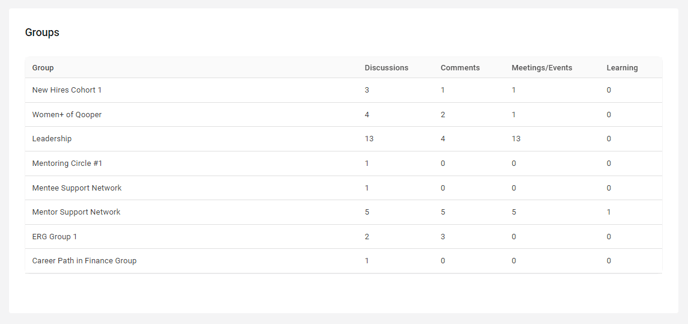
- The Groups chart provides a visual representation of discussions, comments, meetings/events, and learning activities within each group in your program.
-
Key Metrics:
- Identify the amount of discussions, comments, meetings/events, and learning associated with each group.
- Gain insights into group engagement and participation.