While logged in to your Admin Account at platform.qooper.io, scroll over to the left to open the menu bar and click “Reporting” to access your program insights and analytics.
Next scroll down to the middle of the page until you reach the "Focus Areas".
Every time a user scheduled a meeting, completes a lesson, participates in a group discussion, or leave feedback for their connection that user is required to select a tag that corresponds to a topic.
Here you will be able to get a birds-eye view of what topics your program participants are discussing in the mentorship meetings, lessons completed, group discussion boards, and in the feedback they are leaving for their connections.
HINT: These tags are unlimited and customizable. You can access and edit your tags in the Program Materials section of the admin dashboard. Qooper's best practice recommendation is to select your tags based on the goals and outcomes of your program in order to collect relevant reporting.
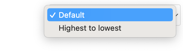
You have two views to chose from in the upper right hand corner of this section "Default" or "Highest-to-Lowest" which sorts your tags based on number of participant's activities associated with a tag.
The colors show on the graph relate to the user's activities.
Green - Corresponds to number of learning lesson's completed by users with this tag.
Purple - Corresponds to number of goals completed by users with this tag.
Blue - Corresponds to the number of meetings scheduled with this tag.
Orange - Corresponds to the number group discussions with this tag.
Red - Corresponds to the number of feedback left for a connection with this tag.

If you scroll over a bar graph next to a topic you'll get a breakdown of the activities that are associated with that tag in the program. For example in the above photograph is showing that the tag of "Mentoring" is associated with 3 lessons and 1 meeting completed by participants.

If you want to view only specific activities on the graphs, you can click on the color key of each activity to deselect it, showing only the ones you want.
In the example below, the admin wanted to see tag reports based on meetings scheduled, so they deselected Goals, Discussions, and Feedback, leaving only Meetings visible. This allows a clear view of the meeting-related tags such as mentoring, events, and celebrations.